This is the third in a four part series comparing WordPress with RapidWeaver (and speaking of RapidWeaver, don’t miss the comment from a lead RW developer on that review).
WordPress, a blog publishing system for Mac, PC, or Linux. I’m assuming that most people who read this probably have heard of WordPress and have perhaps noted that many blogs use it. In terms of blogging platforms, WP ranks second in use only to Google’s Blogger. That equates to millions of users. What accounts for this popularity? In short, it works. And it’s free. Not only can you get a blog up and running quickly with WordPress, you can manage your blog with one of the best browser-based administration panels out there.
If you’re considering WordPress, you need to understand the difference between WordPress.org and WordPress.com.
WordPress.com
The .com option is the WordPress answer to Blogger. It’s a commercial web hosting venture which employs a version of WP that allows for multiple blogs within one installation. Once you sign up, you get hosting space, automatic installation, and a fixed number of themes, plugins, and widgets to customize your site. In general, you won’t be able to modify much and you can’t put ads on it. However, you will be able to modify more than you would with Blogger. You’ll be able to choose from a palette of widgets, move them around on your sidebar, choose a header photo (this option is only available with some themes), and activate some plugins, but you won’t be able to style your page or modify the theme layout/design with the free package. Nor will you be able to choose from the wider universe of WP plugins and widgets available around the web.
The basic package is free, but there are paid upgrades if you want to customize the styles of your chosen theme, get more storage space, or change your domain name to something other than your_blog.wordpress.com. Most users choose the WP.com option because it’s easier to use, it’s just as free as the .org version, it offers better technical support, and it includes site hosting.
Last point: since you will be using tried and tested themes, plugins and widgets with this option, you will be ensured of a standards-compliant site.
WordPress.org
The .org option offers an open source package of core files to run a WP blog. It is free to use and abuse however you’d like within the terms of the General Public License. If you choose this option, you will get a download of the files needed to make WordPress run, but you won’t get a place to host it, you’ll have to install it yourself and you won’t get dedicated support. You will, however, have access to a veritable sea of plugins, widgets, and themes — and you’ll be able to fully customize and tweak your site. In other words, you have a level of freedom unmatched by what you’d get from a WP.com hosted blog. If you want the full features of the .org version, but don’t want to deal with the hassle of setting it up, there are many hosts that offer automatic installation (or you can get a WP expert to install your blog for free if your web host meets the requirements).
Last point: you may also choose the multi-user version of WP if you want the ability to have limitless blogs with unlimited authors with only one installation. It’s freely available as well (and, in case you are wondering, it’s the same platform used by WP.com).
This rest of this review will focus on the WordPress.org package because the flexibility inherent in this version most closely approximates the full capabilities of RapidWeaver.
Who is it for
While RapidWeaver is a website creation tool that also supports blogging, WordPress is first and foremost a tool for the weblog. Sure, you can add static pages to a WP site, but it is primarily designed to handle dynamic content. And it’s designed to support things that bloggers need most (moderating comments, managing posts, adding categories and tags etc.) right out of the box. While you can add photo pages, videos, and a variety of other content to your WordPress blog (either in posts or on stand-alone pages), it is generally not as easy of a task as it would be on RapidWeaver. And that’s the main difference. If you don’t want to pay any money up front, flexibility and customization options are important to you, and you have some (or great) knowledge of CSS and HTML, it’s a superb choice. It doesn’t hurt to know a bit about PHP and MySQL, too. If you don’t know anything about this stuff, you will still get a lot out of it because the basic administration tools are quite simple and robust. You just won’t be able to customize your site design/layout as much as you might like without a bit of research and studying.
About Themes, Plugins, and Widgets
Just like RapidWeaver, WordPress is based on the template (WP calls them themes). As I’ve noted before, templates are great because they are generally designed by people who know something about, well, design. Most of the hard work is done for you. However, if you roam far and wide for WP themes, you may find that some of them are not standards-compliant. Most are, though. However, they may no longer be compliant once you’re done modifying them. Fortunately, your can test this out compliments of the free W3C validation tools.
In addition to themes, WP offers plug-and-play extendability with plugins and widgets. Plugins are bits of code created by clever individuals that extend your site’s functionality. There are a ton of them out there and they are generally extremely easy to deploy. Some of the most popular are Askimet (a very effective spam filtering plugin), the ‘All in One SEO pack’ (to easily optimize your site for search engines), Google Analytics (to get some site stats), WordPress.com stats (more stats — you need to sign up for WP.com to use them on your site but that doesn’t mean you need a WP.com-hosted site), and Lightbox (responsible for the screenshot behavior of this site). But that’s just the very tip of a large iceberg. The WordPress plugin page is a good place to start your search.
Widgets are a special type of plugin. They are basically chunks of code that you can mix and match with ease to customize you sidebar content. WordPress comes with a bunch of widgets out of the box (search tool, calendar, recent posts, etc.), but that’s just the start. In addition to the standard WP widgets, for instance, this site uses an enhanced blogroll widget (which rotates links every time the page is loaded), an enhanced recent comments widget (to display chunks of the most recent comments) and a Feedburner widget (to optimize this site’s RSS feed).
Adding plugins, themes, and extra widgets to your site is easy. I’ll touch on this in the next section.
The basics of how it works
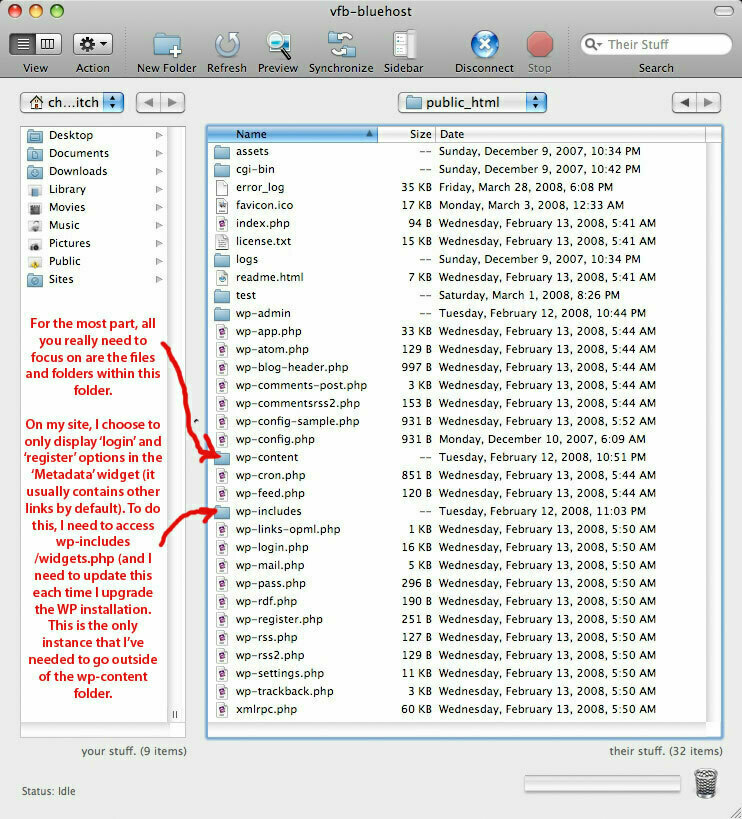
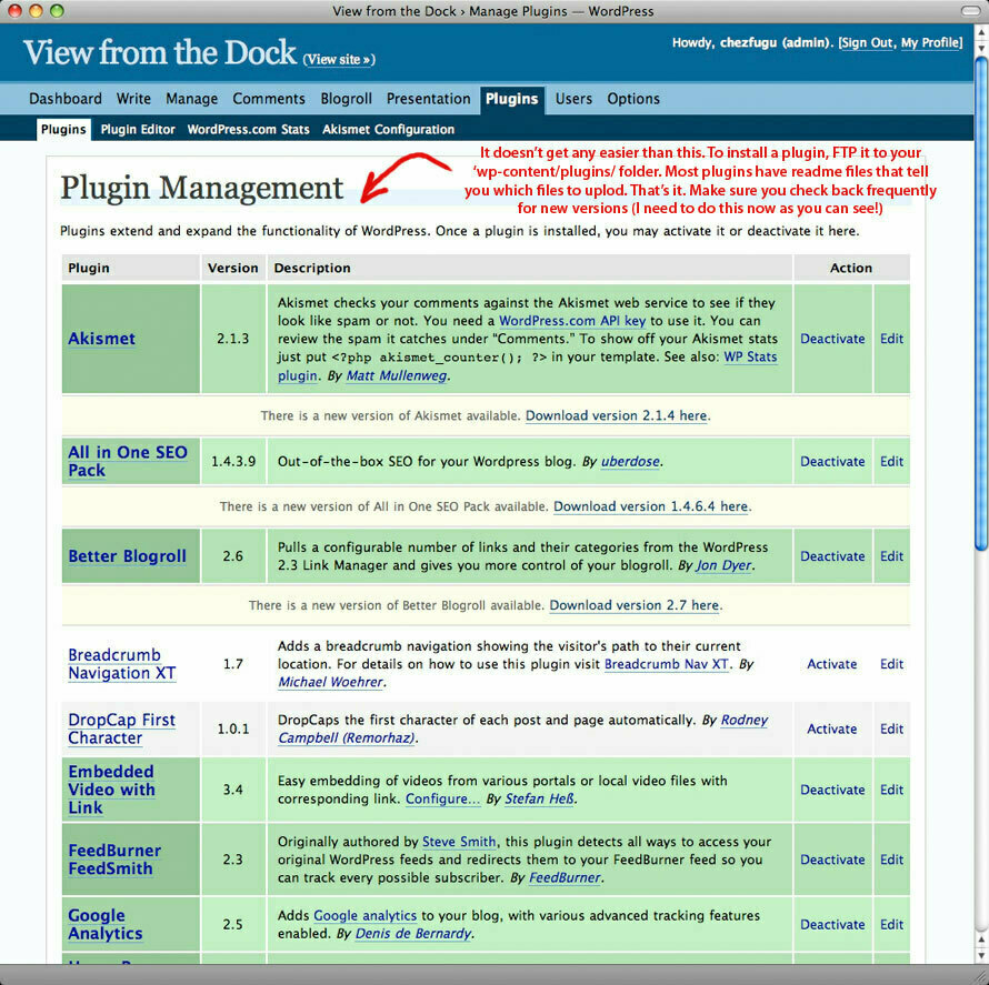
Now let's take a step back and take a deeper look at how WordPress is setup and how you manage it. I'm not going to go into great detail here, but it's important to have a basic understanding of how it's put together. Once you install WP at the desired location on your web host, the first thing you notice is that there are a heck of a lot of files and folders. Fortunately, pretty much everything you need to access is located in one folder labeled wp-content.
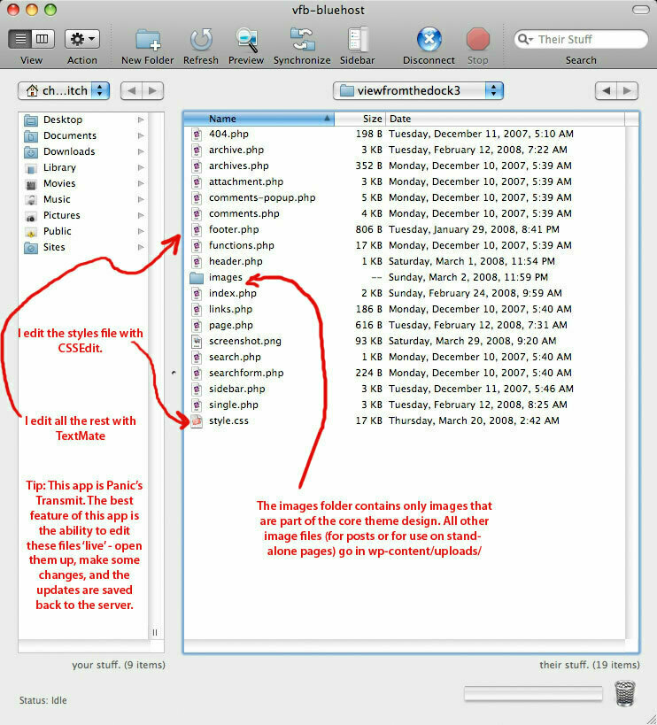
Inside there, you’ll find a plugins folder, an uploads folder, and a themes folder. My assumption here is that you have some sort of FTP client with which to install and view these files. If you don’t, you’ll need one. I use Panic’s Transmit.
Installing new themes and plugins couldn’t be easier (remember: extra widgets are also installed as plugins): you drop your new theme files in the themes folder; and (you guessed it) you place plugins in the plugins folder. The uploads folder is a good place to store images and other files that you want to place on pages or in posts. This organization scheme permits you to change themes on the fly while ensuring that your plugins and extra files remain properly in place. In other words, all of the images, files, and plugins are separate from your theme. That way, you can change your theme and your site maintains the same functionality and content, just with a new look.
All of your posts, comments, tags, etc. are also separate from your theme files — they are stored in a MySQL database. WordPress works its magic with PHP, an open source language that dynamically calls up and displays data and content from your database. It’s a bit complicated if you’ve never worked with it, but WordPress offers extensive documentation to help you understand how a site is managed. In a nutshell, the theme files control the layout/design and styles of your site (and you can manually add static content in here, too). The theme also contains all the PHP functionality that makes your blog dynamic. If this all sounds complicated, it is. It takes some getting used to. Once you get it down, though, you’ll find that WP is perhaps more robust and flexible than RapidWeaver, mainly because all of WP is accessible for modification and the pool of people who make plugins and themes for the WP platform is huge.
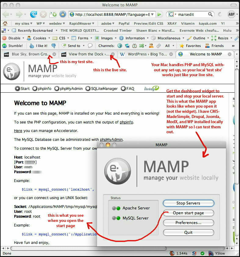
The hardest part to get used to with WP is how the PHP pages are split up into sections (into separate header, footer, index, etc). When you load up a WP blog page, all these disparate parts are called into play via the PHP code and then reassembled on the fly to spit out a dynamically-generated HTML page in your browser. When I first started to understand how all of these PHP files work together (and I confess I don’t understand all of it) it struck me as quite ingenious. It reminds me of an analog watch: looked at from the front, it’s a stylish, simple interface that tells the time. But open up the back, and you reveal a blur of cogs and springs and little gears somehow working together to create the time. Anyhow, to really get it, be prepared to spend some time with it. My suggestion? Try installing two copies of WP on your web host (one to use for your blog, one to hide and play with) or install MAMP on your Mac and install a copy of WP there. MAMP, by the way, is a great tool to set up a personal webserver.
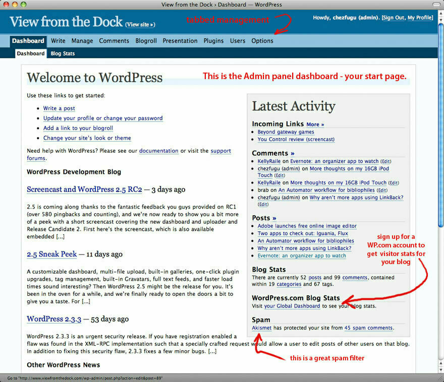
While RapidWeaver content and user options are manipulated on a page-by-page basis and via inspector panes, WordPress is managed from a browser via a web-based Admin panel. The obvious benefit of this approach is that you are not tied to your desktop to manage your site. The Admin panel is the heart and soul of WP. It’s designed to give you the tools you need to effectively manage a site, even if you’ve never done anything like this before. For the most part, it succeeds. There are many aspects of the admin panel that I really appreciate. For instance, it’s very easy to activate and deactivate plugins. It’s as simple as turning them off and on. The discussion (comment) moderation is also excellent. You can choose to moderate every comment, just moderate comments from new users, or choose many options in between to get your settings just right. The built in commenting options blow RapidWeaver’s external Haloscan.com comment solution out of the water. In fact, many say it’s the best of any platform.
In fact, the level of fidelity with which you can control almost every aspect of your blog is superior. Given this tool is specialized for blogging, perhaps that’s not too surprising. You will also appreciate how easy it is to delete or edit a comment, monitor registered users, and move Widgets around (which is a pleasant drag-and-drop experience). You can also email posts in remotely with a few simple set-up steps. Like RapidWeaver, though, some of the admin windows are so chock full of options that it can be confusing to grasp.
For me, the weak link in the Admin panel is the tab for writing a new post. WP allows you to enter your post via a WYSIWYG or code-based window, but I find it to be clunky and limiting. At times, I’ve made changes to my posts via this panel only to find that other parts of my code changed in unexpected ways. I shudder at the thought of typing up a lengthy post (like this one) through the Admin panel. Likewise, I don’t care for uploading images or files for my posts via the Admin panel. I think it’s tedious; and it’s awkward to go back and move or change file names using the panel. My preference for editing and modifying posts? More on that in the next section.
To summarize the basics: you add themes and plugins by dropping them into folders on your web host using an FTP client; you manage all of your content, presentation options and plugins via the Admin panel; you change the design of your site by modifying the PHP and CSS files of your theme. Easy right? It’s actually not as complicated as it may sound, and it’s much easier if you use some good third party Mac apps.
Using Third Party Apps
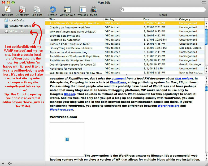
Much more so than RapidWeaver, WordPress benefits greatly from the addition of third-party editing tools. For instance, I previously noted that I find writing posts on the web-based Admin panel a little annoying. It’s not that the WP Admin panel is bad. It’s actually quite good, especially compared to other CMS admin panels I’ve used. Still, once I tried MarsEdit I discovered how much better the experience could be. If there is one companion tool that is a must-have for writing, editing, tagging, and categorizing posts, this is it. Some people choose to set up MarsEdit to accurately preview what the post will look like. As I’ve mentioned, I post to a local server on my Mac on a mirror copy of this website using MarsEdit. I polish it locally, then publish it once I’m done. I find this to be an ideal set up.
Another third party tool you will need is a good FTP client. This will be useful when you need to update WP to a newer version (make sure you back it up first!), add new plugins or upload images.
If you are inclined to create/modify your theme, you will also benefit from an external editor such as TextMate or BBEdit/TextWrangler and a CSS editor like CSSEdit. I don’t want to go to deeply into this topic, but I want to point out that WP really rocks when you get a good workflow going with some extra tools. Of course, this comes at a cost. If I add together all of the third party tools I use to manage the site, WP actually cost me about as much as RapidWeaver! I have to ask myself how much of the pleasure of working with WordPress is due to these additional Mac apps. Tools like CSSEdit, TextMate, MarsEdit, and Transmit truly make it a pleasant workflow. In fact, one of the main reasons I stuck with WP for this site is because I really like to use these tools. Sounds kind of silly, perhaps, but I’ll stick by it.
Here’s one final tip: you can set up your WordPress admin panel to appear as a desktop application (and put it in your Dock) using a little app called Fluid. It’s still in Beta, but I’ve found it works great. With Fluid, in fact, you can set up any web-based app to function as a stand-alone application. Very handy.
Conclusion
So here’s the thing about WordPress: it’s a question of how far you want to take it. Pretty much anything you want to do is possible, but the need to understand a bit of what’s going on with the code behind the scenes increases exponentially the more you deviate from the standard WP model. In this sense, WordPress is an excellent training tool to learn about PHP, MySQL, CSS, and XHMTL. As I’ve said, I strongly recommend installing a version locally on your Mac using MAMP just for this purpose. Over time, you’ll start to gain the ability to bend your site to your will with greater skill. Until that time, however, you’ll be surprised how far you can get with existing themes, plugins and widgets.
While it’s certainly harder to set up (if you do it yourself!) and has a steeper learning curve than RapidWeaver, where you can take your blog with this version of WP is limited only to your ability, imagination and experience level.
What do I love about WordPress?
º It's free º It's easy to set up and maintain º Templates, plugins, and widgets abound º The admin panel is full-featured and about as intuitive as any that I've seen º It integrates exceptionally well with other editing tools, particularly MarsEditWhat's not to love?
º Compared to RapidWeaver, editing your site styles is more difficult º Editing your theme is even harder for beginners º The built-in WP theme editor is not easy to use º Updating a WP installation takes some patience and knowledge of FTP; it's also a bit scary º Compared to RW, support for adding slick graphics, javascript, video, etc. is certainly not as simple (but there are many plugins to help you along) º Since you can do whatever you want with this WP installation, it's easier to break web standardsIf you are looking for a free and flexible tool to fire up your own blog, WP is a solid choice. It’s not only free and flexible, but there are just tons of user-created add-ons that you can quickly drop right in to your site. If you get stuck, you’re in luck: the web is rife with tips and tutorials and fixes for WordPress. I haven’t come across a problem yet for which I couldn’t find a ready-made answer online within a few minutes of searching. The user forums are great and instructions are comprehensive. The last thing I’ll note is that WordPress could do a better job at explaining the various options available for new users (.org, .com, multi-user, etc.). It took me a while to sort it out. I hope this review helps some readers make an informed choice.
That wraps it up. Next, I’ll conclude this series with a final summary comparison of RapidWeaver and WordPress.