This week, I decided to seek out alternatives to NetNewsWire, the popular feed reader from NewsGator.
My disenchantment with NetNewsWire began soon after NewsGator updated the app, switching from a private syncing service to Google Reader at the end of August. I didn’t have any trouble migrating my feeds to Google Reader, as some users did. I also didn’t mind that the updated version of the NNW desktop client displayed unobtrusive ads. Hey, it’s free (A paid version is in the works to get rid of the ad; a paid, ad-free version for iPhone is already available).
My problem with NetNewsWire is all about the iPhone app. Before NNW switched to Google Reader, my iPhone app was reliable, quick, and pleasant to use. After I upgraded to the newest version of the free NNW iPhone app, syncing began to take much longer and, more importantly, ceased to function reliably. Sometimes it would sync, sometimes it would not. It drove me crazy. Often, it would appear to sync correctly, but selecting a feed would result in a blank screen or (even more annoying) a blank screen with an embedded advertisement. I put up with this spotty performance for weeks (hoping it would get better, hoping it would be upgraded) before deciding to try something else.
I’m not saying that the NetNewsWire iPhone app is terrible. Based on user comments I’ve read, many people seem to be happy with it. I will say that, in it’s present version, I can’t use it. A reliable feed reader on my iPhone is important to me. This frustration led me to consider other options. Since there are many, many front ends to Google Reader for the iPhone, why not shop around? It was an easy decision. And since I decided to try out something new for my iPhone, I also decided to try out other desktop clients. It was sort of a reverse halo effect.
After sifting through a plethora of reviews for iPhone RSS readers, I decided to go with Byline (from Phantom Fish, current sale price: $3.99). I’m pleased with my choice. The interface is clean and simple. There are many customization settings, the best of which is that I can choose to cache from 25 to 200 feeds for offline viewing (great for subway commuting). I can also set it to cache items only when I’m using Wi-Fi, which is a handy option given I’m on a slow Edge network. Another nice touch is that I can choose to cache Web pages linked to feed posts. I can also read my feeds in landscape mode. It’s worth a look. The one glaring item I’m missing is the ability to mark a folder of feed items (or all items) as ‘read.’ As far as I can tell, I can only mark individual feed items as ‘read.’ A minor annoyance. According to the developer notes in the iTunes store, a new version is due out very shortly which promises to be a ‘major update.’ I’m looking forward to it.
As for a desktop replacement for NetNewsWire, the vote is still out. I’m currently testing two options: Gruml and feedly.
Gruml, currently in late stages of Beta, looks and operates much like NetNewsWire. The main difference is that Gruml offers more features. It allows me to send an article link from my feeds direct to a variety of social media sites. Or I can send an article direct to MarsEdit, which I find very handy (more blog tool integration is forthcoming). I can also post to Instapaper, my favorite iPhone ‘read it later’ app. More, I can share items and add notes to articles (options currently unavailable with NetNewsWire). So far, I like it. It’s easy on the eyes and is a quick, efficient way to get through a lot of feeds. It’s much easier to look at than Google Reader.
Feedly, on the other hand, is something completely different. It’s a free browser-based aggregation service (available on the Mac for FireFox or Safari) that presents your articles in a pleasant, customizable magazine style. It offers strong social media integration and fancy algorithm-based filtering/recommendations that purportedly improve over time based on reading habits. It’s also highly customizable. I’ve tried these kind of news readers before and never really cared for them, but this one is pretty slick. I vastly prefer it to the iGoogle service. I’m giving it a go. We’ll see if I like it as much a month or so from now.
Meanwhile, I’ve left NetNewsWire behind. I don’t miss it. If you have a suggestion for a killer feed reader for the desktop or iPhone, I’d love to hear about it.
Posts in "productivity"
OmniWeb is now free
 OmniWeb is now a free browser. I'm a huge fan. I purchased OmniWeb long ago to take advantage of this browsers powerful features. It used to cost $15, but now cost nothing as of last Wednesday.
There are many features of this browser that make it special.
OmniWeb can manually store a set of pages in a 'workspace' so that you can easily recall them later. For instance, I have created a named workspace with five sites I use for work; a named workspace with sites related to house hunting; and named workspaces for two different projects I'm currently researching. Handy.
It also displays thumbnail previews of open pages in a fly-out window, which is a nice way to visually navigate between sites.
The best part is that it allows you to save unique settings for individual domains. This is useful for anyone, but particularly useful in terms of accessibility. My father-in-law, for example, has bad eyesight and is not computer saavy. So I set him up with an OmniWeb workspace. All he has to do is click on his workspace, and all his favorite financial sites load. For each site, I used OW's per-domain settings to boost text size to the largest settings possible without breaking each respective site. I also set up each of his favorite sites to open at a particular place on the page so he doesn't have to scroll around to get to the sections he most wants to read. And I set per-site ad blocking: this feature is fine-grained enough to select blocking of known ad sizes, pop-ups, third-party sites, and/or blocked URLs. OmniWeb allows you to optimize an individual domain so you get only what you really want to see. Again, handy.
There's a whole lot I like about OmniWeb, so I was glad to read that the browser will continue to be updated by OmniGroup (at least through version 6.0 -- it's now at 5.9). I'd like to see it go open source some day, but that's not going to happen in the short term. By the way, the browser runs on WebKit, the same engine used by Safari.
The Omni Group also made several other apps free last week, including the screen effects and presentation tool OmniDazzle, the memory optimization tool OmniObjectMeter, and the disk cleanup tool OmniDiskSweeper.
Lessons Learned: essential apps, a few tips
I spent the past month on a ship out in the Gulf of Mexico serving as a data manager for a research expedition. I won’t bore you with details about what I was doing, but I want to share some observations about my computing experience. I brought aboard a new 15" Macbook Pro running Leopard with a virtual install (using VMWare Fusion) of Windows 7 Beta. Windows was essential, as the database in which I did my day-to-day work was not Mac compatible. Here are some highlights:
- Data sharing: While many of the people on the trip used Macs, several people used PCs. Among us, we probably had about 30 Terabytes or so of external disk storage. Problems arose when we needed to share data. The PC people’s drives were generally formatted in NTFS. The Mac people typically used HFS+. The NTFS-formatted drives would mount on a Mac, but were read-only. The HFS+ drives would not mount on Windows PCs. No one used the FAT32 format, which is the only format that I’m aware of that is read/write on both platforms. We ended up formatting a few drives in the FAT32 format so these drives could be moved around and shared. Since my disk was one of the external drives that had to be shared around more than others, my solution was to set it up with multiple partitions: an HFS+ partition to use for my SuperDuper Clone backup, and a FAT32 partition for shared data. One interesting note: I formatted a 1TB drive with multiple partitions on a Mac in a matter of minutes. In comparison, it took about eight hours to format a 1TB drive with one FAT partition on a very robust and powerful PC laptop. Egads.
- Data backup: I was surprised that many people did not have a backup solution on the cruise. If their laptop tanked, they would not only potentially lose data, they would be out of commission for the duration of the expedition. I choose a cloned backup over Time Machine for this trip. The reason is simple: if something went terribly wrong with my laptop’s OS, I could at least boot from the cloned external drive and keep working until a point in time when I could take a time out to restore from the clone back. With Time Machine, I would have had to stop working until I solved the problem or restored the backup to the laptop (which can be very time consuming).
- Force-eject a CD: It’s good to know how to do this. At one point during my trip, I placed a corrupted DVD in my SuperDrive and couldn’t get it to eject. Usually, I can get a stuck disc to pop out by evoking terminal and typing the command ‘drutil tray eject.’ That didn’t work. I tried disk utility. That didn’t work. The solution: I had to disconnect the drive from Windows, as it was in use by Windows via VMWare Fusion.
- TextExpander: Data entry often entails typing the same thing over and over again. TextExpander is unbelievably useful for these sorts of repetitive tasks. In my case, I needed to paste the same blocks of text into my Windows database. I wasn’t sure if TextExpander would work from Mac to PC, but it did. It wasn’t as easy as it is on the Mac (i.e., I couldn’t use TextExpander abbreviations in Windows), but it did the job. Once I had TextExpander populated with a slew of repetitive text snippets, all I had to do was select a snippet from the Mac drop-down menu, then click on it to paste it to the clipboard, then paste into the relevant field in my Windows database. It was a bit cumbersome, but much easier than typing the same thing over and over again.
- Screenshots: I was planning to use Little Snapper to capture screen shots, but found this application to be too cumbersome and bloated for my tastes. I like the idea behind Little Snapper. It looks great. But it just didn’t fit into my workflow. I found myself turning to Yellow Mug’s SnapnDrag. It’s tiny, unobtrusive, and does the job well. It stays out of the way. I’ve tried so many different screen shots apps, and I keep coming back to SnapnDrag.
- iPhone: The only entertainment I brought on my trip was my iPhone. I brought music, books-on-tape, games, and some books to read via the Kindle and Stanza book reading apps. Overall, the iPhone did the job. I was duly entertained. The one exception is this: the tiny screen didn’t cut it for reading a book. It’s a nice idea. It’s not bad for quick reads like poetry or short stories. But it’s just not a comfortable or enjoyable experience when it comes to reading an entire book in my opinion. Next time I’ll bring a real book. Or perhaps I’ll have one of those Mac tablet-touchscreen-Kindlesque-thingies rumored to be just around the corner. Final point: the iPhone also served me well for screenshots on the go. In case you didn’t know this, if you press the two buttons on your iPhone or Touch at the same time, you device will take a snapshot of your screen and place the image in your Photo library. Very handy.
- VMWare Fusion: I can’t speak highly enough about this app. The ability to seamlessly run Windows alongside my Mac, to switch back and forth on the fly, to share folders, and to drag-and-drop between the two operating systems was priceless. Perhaps we take this for granted now, but just a few short years ago this would have been unthinkable.
Choose your browser
I’ve long wished for a flexible, well-integrated tool that would give me complete control over browser choice when opening links. A couple of new applications now in public beta meet this need quite well.
Choosy
 The first is a preference pane application called Choosy from developer George Brocklewurst. Once you make Choosy your default browser, you can then use this tool to direct links to the browser of your choice. Choosy can serve up only browsers that are currently running, or it can offer up all browsers regardless of whether or not they are open. You can also arrange your selected browsers in order of priority via the preference pane and choose an option called ‘use best open browser.’ This will open up the link, as expected, in an open browser that is highest up on your prioritized list. I settled on the option to have Choosy present me with a choice of all browsers, regardless of whether or not the browsers are running (this option presents a nice floating menu similar to what you see with the familiar command-tab). It looks the developer has big plans for this little app: check out his development roadmap. He hasn’t yet announced how much Choosy will cost when it ships.
Highbrow
 The second is called Highbrow from Helium Foot Software. This tool offers many of the same features as Choosy, but there are substantial differences (the most noticeable of which is that it’s not a preference pane). Once you place this app in your applications folder and run it, Highbrow appears in the menu bar (and automatically creates a login item without prompting…I personally prefer to be asked). Since it runs in the menu bar, Highbrow is faster than Choosy when you wish to change your default browser on the fly. The app offers three main options: you can select a default browser from a list of all of your preferred browsers; or you can choose to have your links open up in whatever browser you most recently used (something which Choosy doesn’t offer); or you can have Highbrow ask you which browser you’d like to use to open up a link (similar to Choosy, via a small floating window). Unlike Choosy, it does not offer you a choice among current open browsers. Highbrow will cost $14 (with a $12 introductory price. No details on how long this discounted price will be available once it’s released).
Which one is best?
I tested both out and decided to go with Choosy for now. While both tools do the job, I prefer the way that Choosy works invisibly in the background. It also offers more customization options in an interface that is a bit more polished than Highbrow. If you are the type of person who likes menu bar apps (my menu bar is already quite full), or prefer to manually change your default browser per user session, try Highbrow. If you prefer to select from your currently-open browsers, or always want to choose from among a user-defined list of your favorite browsers, Choosy is a nice, unobtrusive option. The good news is that you can try both out for free to see which one works best for you.
Why Bother?
Why would you want to choose your browser when opening up a link? Web development is a primary reason: it’s often useful to see how a page renders in different browsers. Beyond that, here are few other reasons I like to choose different browsers on different occasions:
Firefox plugins. Sometimes I receive a link in an email and I want to save it in Delicious. I want to send that link to Firefox in order to take advantage of my Firefox Delicious plugin. At other times, I choose FireFox to take advantage of plugins geared towards web development, such as web developer.
OmniWeb power. I often like to use OmniWeb to take advantage of some of this browsers powerful features. For example, this browser allows me to set per-page site preferences, save multiple pages into groups for easy retrieval later on, and set up search shortcuts so I can quickly search a particular website right from the search bar. I also prefer the tabbed thumbnail views of all my open pages.
Safari speed. Sometimes I choose Safari when I’m casually browsing because it’s quite fast.
Fluid. When I’m using Fluid (which I use for my work web-based email so it appears as a stand-alone browser application), I usually prefer to open up links received in my inbox with other browsers instead of in another Fluid window.
A few other apps
Here are a few other (semi) related apps worth a look:
- Bookit. This is a handy advanced bookmarking application that allows you to keep all your bookmarks synchronized across all of your browsers (and across multiple computers using .Mac). It costs $12.
- IC-switch. This free application sits in your menu bar and allows you to change your default browser, emailer, FTP client, and RSS reader on the fly in one location.
- RCDefaultApp. This is a free preference pane that allows you to set the default applications that open for URLs, file types and extensions, and a whole lot more. It’s a must-have little management app.
A telework tale
So, I now have the opportunity to telework once per week. I must say that I like it. Imagine that. But what makes it so great is not so much working in very casual clothing (that's a nice way of saying 'pajamas'), but that I can work on my Mac using tools that I know and rely on.
The thing is, I spend much of my workday at home or the office using the same basic tools: DreamWeaver, PhotoShop, and a text editor. So if I use the same basic software in both environments, why am I so much more efficient at home? Here are some of the reasons I came up with:
1. Launchbar
Launchbar is an application launcher, calculator, easy file opener, etc. It does many, many things. I'm still learning hidden tricks and tips to get more out of this excellent, lightweight application. I expect it to be on any machine I use. When it's not, I get cranky.
2. TextExpander
If you type the same thing over and over again, TextExpander is a godsend. Use it to assign shortcuts to any text you want. I use it for everything from inserting a redirect link to adding a signature block to inserting an image. You wouldn't believe how much time this tool saves.
3. PathFinder
Finder is anemic. Windows Explorer makes me want to cry. PathFinder rules. One feature I particularly like is the ability to save tab sets. I have about five tabs that I like to have open when working on this site. I have three folders I like to have open when working on office projects. I can save each workflow in distinct tab sets, open each up with a click, and I'm ready to go. Having just upgraded to the new PathFinder 5, I'm also digging the split-pane view. At any rate, the main thing I appreciate about PathFinder is how utterly, completely customizable it is. I have honed it over time. It's uniquely adapted to me. It's a weapon. I love that.
4. Spaces
I'm a recent Apple Spaces convert. I didn't think much of it for the longest time, but I'm glad I gave it another look. There are two camps when it comes to using Spaces. Some like dividing up apps into different spaces and some like dividing up tasks within different spaces. It's a subtle difference that you won't really get until you try out both ways. Some may wish to stop reading this paragraph now to prevent a headache. If you want to learn more about the options in Spaces, read on.
To be fair, even if I was using a Mac at the office, I probably wouldn't be able to install many (or any) of the third-party applications listed here due to IT policies. Still, it's worth pointing out how much utility and efficiency result from third party apps. And to be fair regarding my PC use, there are a couple of tiny free PC apps that I use in the office which do contribute quite a lot to my productivity. One is called EditPad. It's a lightweight text editor that sits in the system tray. It offers tabbed pages and does a nice job of stripping out formating on text so I can pop it into a web page. The other is called HotKeyz. This lets me remap my keyboard (I use the Dvorak layout, and this lets me reassign keys so I can still use Qwerty key combos). Unlike the Mac, Windows does not have a built-in Dvorak-Qwerty alternate keyboard layout. What a shame.
So, the difference in how Spaces works is defined by checking or un-checking a preference labeled 'When switching to an application, switch to a space with open windows for the application.' If checked, you will automatically be transported to a space with existing open window for the given app when you select that app (with command-tab). Unchecked, you are not transported to another space when tabbing to an app. Instead, the app is simply selected within that space. You then have the option to open a new window of that app within your space. Alternatively, you can click on the dock icon of that app to cycle through the open windows of that app within different spaces. Note that if you've set up some of your apps to appear only in certain spaces, this won't work as expected. In this instance, selecting an app will not change spaces; but creating a new instance (or page) of that app will transport you back to the space you defined for that app. The solution, then, is to not pre-define your apps to only work within a particular app. Confusing, yes.
I've settled on the later workflow, opting to make each space task-specific, instead of app-specific. I don't have any apps assigned to particular spaces. That way I can have, say, two different TextMate windows open in two different spaces, which is nice when multi-tasking.
Either way (app- or task-based Spaces) works, though. Try both out. What I would really like is to have control on a per-app basis so I could assign a few apps to work only in one space, and other apps to work on a task-management basis within any space.
At any rate, I've finally got Spaces set up in a useful way. I think it can get better, but it's a lot better than what I have on my Office PC...which is basic tabbing through apps. It annoys me to no end that I can only cycle forward through apps on Windows using command-tab. Stupid.
5. TextSoap
I'm also fairly new to TextSoap, but it's growing more useful by the day as I learn how to harness its power. If you deal with a lot of text coming at you from various sources and in various forms (and you need to reformat it for the web or to meet some other style guideline), then TextSoap might be a tool for you. You can use it for simple tasks like cleaning those annoying > marks in emails, or you can learn some regex and really work magic on your text. Warning: not for faint of heart. I'm at the stage where I can't do much (ok, anything) with regex, but I'm giving it a go. TextSoap is still very powerful, though, when you use the more than 100 text cleaners pre-loaded on the app.
6. Hazel
I like Hazel more and more. It's a nice way to automate filing of documents, music files, app downloads, etc. Whenever I download anything to the desktop (or drop a file to the desktop), Hazel takes care of filing it away in the right place for me (it automates color labeling of folders, too). It also has a feature to remove the plist files and other miscellaneous crap associated with a file when you move it to the trash (meaning you no longer need an additional tool like AppZapper). It also takes care of emptying my trash at predefined intervals. Like TextSoap, it's one of those apps that takes a some commitment to learn and set up to your individual preferences, but it pays big dividends.
7. Color-Labeled folders
Such a simple thing. How I wish I could colorize some of my Windows folders. When you are looking at a list of dozens upon dozens of folders, it sure is nice to have a few of your favorites color-coded. I know there's that 'favorites' thing in Explorer, but I hate it. Can't say why. Just hate it.
8. OmniWeb
OmniWeb is not a free browser, which might turn some people off. It shouldn't. It's an amazing browser. Worth every penny. And it's only $15. I bought it a couple of years ago, and haven't had to pay an upgrade fee yet. I most rely on OmniWeb's ability to save groups of pages for easy retrieval in what OmniWeb calls a 'Workspace.' For example, I have four sites that I generally need to have open when working from home. All I need on OmniWeb is open up the 'work' workspace, and all my chosen pages open up. I have about a dozen such saved workspaces for different workflows. I can also take snapshots of pages at particular places. This is handy when I want a site to open and display at a point other than the top of the page. The ad-blocking is also top-notch. As are the per-page setting definitions ... for instance, I set up my father-in-law with the top five financial sites he likes on OmniWeb. Since his eyesight is poor, I adjusted the text size for each site so it was as big as possible without breaking the site. Every one of his favorite sites could handle more or less text size increases. With OmniWeb, I set the optimal large text size so the page still looked good, and it remembers each setting. Brilliant. OmniWeb also has a shared bookmark folder to access bookmarks easily across user accounts. There's much more. It's an incredible browser. It's fast, too.
9. QuickLook
I expect QuickLook to be on all the machines I use. When it's not, I find myself hitting the space bar repeatedly in frustration.
10. Things
I rely on Things to manage my to do list. Everything I enter in Things is automatically synced to my iPhone Things app. And all my 'next up' to do items automatically sync with iCal and Apple Mail. This app is great, and I look forward to purchasing it when 1.0 is released at Mac World next month.
11. Yojimbo
I haven't seen a good note/snippet manager for Windows. I'm sure there is one, but I haven't seen it. There are tons of choices for the Mac. Yojimbo is my current favorite app to collect little items that don't fit elsewhere. I wish they'd update this app, though. It's been a long time ... also wish they'd come out with the ability to sync and store notes 'in the cloud' for remote access, and offer an iPhone version. It's not perfect, but it blows away what I have on my PC. Which is a vanilla linear text editor.
12. VooDooPad
Like Yojimbo, it's a place to dump notes, but it's a different paradigm. It's an elegant little personal wiki. I use it daily. Check out the free Lite version.
13. Bean
I probably have ten or so text editors of various shapes and sizes. After paying more money than I care to admit (I'm a bit of a text editor junkie) I find myself using the free Bean more often than not. It just works well, and it's blazing fast.
The tyranny of the news reader
I've been thinking lately about news readers. I use NetNewsWire on my Mac and my iPhone. It's a good reader, and I've grown to depend on the automated syncing of my feeds between my desktop and phone. I, like many people, only sync 'must read' items to my iPhone. My Mac client is where I download all of my subscribed feeds.
As an aside, here's how to selectively sync your feeds if you use NetNewsWire. The hard way: You get to these settings by logging into your account (assuming you've created one) at www.newsgator.com. Then you choose 'Settings,' then 'Edit Locations.' From here, you can choose which feeds to track on which platform, among many other options. It takes some work to set up initially, but I find it's useful to only sync selected feeds to my iPhone in the interest of bandwidth. The easier way: Fire up NNW on your iPhone or Touch, then select a feed title. Choose 'Edit.' Then choose 'Delete.' This will bring up an option to unsubscribe from the feed everywhere, or just not sync it to the mobile device. Much simpler.
What I've been thinking about is the creeping tyranny of my feed reader. I've found that I've become quite feed-complacent. I have a large set of feeds that I routinely read, and the feed reader saves me time. That's the purpose of a feed reader, right? But over time, I've found that I don't surf around like I used to.
I tend to prefer my feed reader because it's so fast and easy. The result is that I've been reading the same feeds for quite some time, and I find that I rarely add new feeds these days. As I track a lot of mac-related feeds, I've found that it's a bit of an echo chamber. The same posts appear over and over, and it's relatively rare to find something new that hasn't yet been reported on in ten other places.
It seems to me that I used to find a lot of hidden gems by randomly roaming the web. I don't do that as much these days, but I'm going to start exploring again. The internet is a vast place, so there really isn't a good reason to get complacent.
A good tool to break out of the tyranny of the same-old-feeds is StumbleUpon. If you've never used it, it's worth a look.
The advantage of this service as opposed to, say, random web searching, is that you can select a subset of categories that interest you. Then, when you have a few spare moments and feel like exploring, you click the Stumble button (I use a FireFox toolbar) and are taken to a randomized site that falls somewhere within the range of the site categories that interest you. Sometimes the sites suck. Sometimes the sites are magnificent.
The one thing that is certain is that the service will take you to sites you may have never otherwise encountered. As a blogger, I'm often looking for something new and interesting to comment on, or looking for an interesting site or idea to share. This service is a great idea generator. It's also a good way to enjoy yourself as you explore the web ... and rediscover why it's called the World Wide Web.
So this is a call (to myself, really) to break away from the news reader more often and surf. And it's a call to refresh my feeds more often. There's a lot of content out there waiting to be discovered.
The Spectrum of PIM
Long ago, I began an information organizer review series. I started out strong. I posted a nice little intro piece. I knocked out the first review in the series. Then it utterly unraveled for two reasons.
First, Alan over at Metadata weighed in that VodooPad shouldn't be in my review group (which included Yojimbo, DEVONThink, Together, and EagleFiler).
He followed up that thought with a post on his blog in which he suggested we divide info organizers into two distinct categories: those that help us organize existing data, and those that help us create new data (or, as he restated at the end of his post: "creators let you manipulate data, whereas organizers let you manipulate metadata").
It's a great article, and the foundation for this post. I agree with much of what he said, but as you'll see, my model differs a bit from his.
I've concluded he was right about VooDooPad: you can organize existing documents with it, in the same way you can use Word to store a list of all of the books you own. But why would you? Other apps are far better suited for the task.
So, as I was pondering this, I was offered a new job. And that's the second reason for the long delay. As I've mentioned here many times now, I moved. I'm still recovering (and unpacking).
Now I'd like to resume the discussion. This is an attempt to build upon Alan's post by proposing that we present organizer apps on a spectrum. I want to reemphasize that, in the spirit of collaboration, this draws heavily on the ideas from Alan's post. Go read that first.
So here it is. There are three main categories of info organizer applications that form the spectrum of PIM:
1. Finders
These applications strive to serve up something better than Apple's Finder to archive, organize, and search through your important documents. Apps in this category tend to focus on giving you powerful metadata tools to help you find what you need and organize your existing documents/files (thanks, Alan). Examples are Leap, PathFinder, EagleFiler, Together, DEVONThink.
2. Creators
These apps focus on providing a better notebook experience. They provide a central repository to create and collect notes, ideas, snippets, multimedia clips, and (to a lesser extent) existing documents. Simple interfaces, quick entry, and rapid search are emphasized. Examples are Yojimbo, Evernote, Notebook, VooDooPad
3. Visualizers
These applications focus on providing a better creative space in which to help you plan projects and gain insight into your data. Examples are Curio, Tinderbox, OmniOutliner
Since many of the functions of these applications overlap each other, I think it's helpful to view them on a spectrum. We can then perhaps get a better sense of where on the spectrum a given app fits. The screenshot on the right, for example, shows where I think DEVONthink fits on the continuum.
The fine print
Now a word about info organizers, info managers, PIM, or whatever you want to call these kinds of apps. I've had so many people ask for recommendations on applications that fall in the info organizer realm. I think there are no clear answers. Part of the problem is also a great strength of the Mac platform: the glut of third party app choices. And part of the problem is that many of us aren't really sure what we want.
The explanations (read: marketing) provided by many Mac 'info management' apps don't help much. So there it is: we have too many choices, the essential functions of these choices are not well enough defined, and the reason the definitions are broad and vague is because the apps themselves offer solutions to a very wide range of info organizational problems.
Some organize existing data, some help create new data, some help visualize connections amongst data ... and most do all of these things to some degree.
We know that most (or, at least, the best) info organizers do a lot more: they help us find things more quickly, make connections between disparate items, and come up with new ideas. They aim to help us solve uniquely modern problems: to fight information overload, to cut through clutter, to combine the super powerful with the super simple interface, to help us make unforeseen connections, and to serve as a nesting place or (better yet) breeding ground for our thoughts.
If we have a glut of PIM apps, it's because we have a real need to manage the wash of information that is cluttering our lives. With our computers serving as the repository for all of our info, data, thoughts ... we clearly need to find a way to pull it all together. To make it perform for us. That's the new paradigm. Some focus on organization, some on creating new info, and some focus most on tying together all stuff into some sort of coherent package so we can find our way forward.
Which you choose will depend on what you need. Ultimately, I think the winners will not necessarily be the ones that pull all of these elements together in one application. Rather, I think there is room enough for lots of variety. Our challenge, then, is to pick the right apps to do the job, but to pick the ones that do the job in a way that is natural for us. While it's true there may be too many options out there right now, that's the nature of competition. The best ones usually stand the test of time.
I plan to use the spectrum framework as I return to reviewing some specific applications. In the spirit of choosing apps that clearly fall within a 'band' of the spectrum, my review choices will change from the original lineup (I'm still deciding which ones I want to tackle).
When I'm done, I'm considering placing all the major info organizer apps (not just the ones I reviewed) on the spectrum with the aim of helping people sort through all of the choices.
I'll close with a word on the acronym PIM and the phrase 'info management.' I think they are both hopelessly broad and meaningless. Every program used on a home computer is, in a sense, a personal info manager. Sadly, I'll probably keep using PIM out of habit. After all, spectrum of PIM sounds much better than spectrum of info organizers.
Some clever person should devise a better term. I kind of like 'personal content assistant,' used by the folks over at Eastgate Tinderbox. Or perhaps we could use MIP: making information perform.
Catching Up, Lessons Learned
Well, I'm happy to say the move is over. Before I recap some of my technology-oriented 'lessons learned' during this period of transition, I'd like to respond to some of the comments received over the past couple of months while I was not monitoring this site:
1. Reader Lek asked how to convert (or move) a site from Rapidweaver to WordPress. The only way I am aware of to do this is to manually transfer posts and comments. There are no automated ways to do it that I know of. If anyone knows of any tricks or tips in this department, please let us know.
I did, however, come across interesting threads related to MarsEdit and RapidWeaver that are worth checking out. Both threads relate to using RW for static content and another system (e.g. WordPress) for a blog on one site.
2. A couple of readers commented on the current bugginess of RapidWeaver, and reader PanicGirl noted the lack of ability to directly edit code in a RW blog. About the bugs: it does has some flaws, but I maintain it's about the easiest way to get a site up and running for people who don't want or need absolute control, but want quite a bit of flexiblity. And, no, you can't edit HTML directly in RW. It It may not be the best tool for those who want total control. For those who do want such control, RW templates are fully editable, but it takes a fair investment of time to learn how to do it.
3. PanicGirl also asked if MarsEdit is the best tool to use with WordPress, and if I'd tried MacJournal. MarsEdit is the best tool that I know of to manage my WP blog. It saves me countless hours. I haven't used MacJournal for a long while (in the days before it had this feature, back when it was donationware). Sounds like this would make a good future app comparison.
4. Reader Gary commented on my Yojimbo review, noting that worrying about potential database corruption in a SQLite database is different than actually experiencing database corruption. I haven't come across any users who actually had such corruption. My Yojimbo database has never given me any problems. Point taken.
5. I received several new app suggestions regarding the long-delayed Mac PIM review series (which I started before the move, then was forced to abandon because of the move). I'm still scratching my head a bit over the Info Manager comparison idea. All of the suggested applications are certainly worthy of review, so my challenge now is to regroup and decide how I want to tackle this comparison in the coming months.
To recap, I began a comparison between five info management apps back in May(!), but have only completed a full review of Yojimbo to date. I floundered for a while, too, on just which apps I should choose for this series. I think I may opt for more reviews, but markedly shorter reviews for each app. I'd like to spend more time discussing the range and categorization of info managers to help place them in better context, which will hopefully help to sift through the sea of choices out there for the Mac. The term 'Personal Info Manager' really doesn't cut it, as fellow blogger Alan aptly pointed out in a post on his site. Stay tuned for more on this. This topic has become a minor obsession.
6. Some other readers took the time to post some nice comments on various reviews on the site, to which I say 'thank you.' And I thank all readers for their patience during this long offline period. Curiously, my RSS subscriber base actually increased over the past two months, despite the dearth of new material. Go figure.
About the Move
Now for a few words about my move from Hawaii to Maryland. I spent the better portion of the past two months without internet access, and without my desktop Mac. Fortune smiled on me, though: right before I moved from Hawaii, a friend upgraded to the 3G iPhone and graciously gave me his 16GB 1st generation iPhone for a pittance. I've always used employer-provided cell phones, so this was the first time I actually had my own mobile device.
I can't stress how useful the iPhone has been during this period with no home, no easy internet access, and no computer. Here's what I took away from the experience:
1. My next Mac will be a Macbook Pro. I love my 24-inch iMac, but I'm now ready to sell it. Since the thing I love most about my current desktop is the large display, I will buy an affordable large display and will dock my laptop while working at home. It's a much more expensive solution, but it's worth it.
2. The iPhone Google Maps application is incredible. The cell tower triangulation employed by my 2G iPhone worked unexpectedly well. We used Maps more than any other single application during the move to get directions to potential new rental homes, to find nearby stores, and to figure out where we were. Transitioning from Oahu's few roadways to the serpentine routes of suburban DC has been jarring.
3. I missed the ability to update my podcasts. The iPhone needs the ability to download casts on the fly, without the need to tether up to iTunes. Judging from Apple's unfriendly and illogical response to the first iPhone app to offer this service, I guess we won't get this functionality any time soon. That's a shame. As many have already noted around the Macosphere, Apple's bizarre and murky iPhone application acceptance/denial policies (coupled with their lack of transparency) threaten to dissuade developers from making great apps. This anticompetitive streak is sad to see. Excellent, inventive third party apps are the soul of the iPhone platform, just as they are the soul of the Mac.
4. Cultured Code's Things for the iPhone worked well for me, but I wonder why it doesn't include the 'Areas' feature of the desktop app. Nevertheless, I relied on it to manage dozens upon dozens of tasks, and it held up beautifully. I was a bit surprised to see that Things 1.0 (desktop) now isn't due out until the Fall, but at least we have a very good Beta. Odd, though, that Things for the iPhone rolled out for $9.99 right from the start.
5. Evernote's iPhone app also served us well. We used this app to store all of our critical data (airplane, hotel, and car reservation confirmations, etc.) for quick and easy access. I have no real complaints about it. It did what I needed it to do. Still, I would love to see Yojimbo compete in this arena. I'm not willing to shell out $30 for the limited functionality of Webjimbo.
6. Agile Web Solution's 1Password did the job, but I was a bit frustrated by the way it opens up links within the application. I prefer to use mobile Safari. I actually think I liked the first iteration of 1Password (the web-based solution) more than I do the full-scale iPhone app, simply because I often surf to a site in Safari, then realize I need a password. In such a case, it's inconvenient to have to exit Safari, start up 1Password, then load the page again within 1Password.
7. The AT&T network is surprisingly spotty. In our new home, I can't get a decent signal ... yet my wife can get a great signal on her cheap T-Mobile pay-as-you-go phone. I expected the iPhone to have a better signal in most locations, but that hasn't been my experience.
8. I downloaded WordPress for the iPhone before I packed up my desktop, but I have yet to use it. The problem is one of ease of use: I just can't see myself typing a post on that little touchscreen. I'm awaiting a bluetooth-enabled mini keyboard.
9. I'd like to add my voice to the choir regarding the lack of cut and paste on the iPhone. It's a basic, essential feature and I'm dumbfounded that we still don't have it at version 2.1.
That's about it for now. It's good to be back.
Ubiquitous Data
I’m on the road this week in Washington, DC. Away from my desktop Mac, I’ve been thinking about data synchronization and the cost we should expect to pay for it.
It seems that everyone is coming out with syncing solutions, and most of these solutions include web-based access to data. And soon, we can expect a flood of iPhone/Touch applications — many of which will be modified versions of traditional desktop Mac apps. We’re on the verge of a significant evolution in data synching and universal data presence.
On that note, I want to point out that NetNewsWire, the popular RSS reader, now offers online syncing. This update came out last month, but this is the first opportunity I’ve had to test it out on the road. It works well. It allows me to easily access my RSS feeds, whether on my iPod Touch or on the PC laptop I’m using (under protest) for work. While there are many RSS solutions out there, the free NetNewsWire is one of the best. The addition of syncing means that I can manage and maintain my RSS feeds from any location.
It’s no stretch of imagination to see that seamless synced data is the future, and that this future is coming fast. What I’m talking about is ubiquitous information — the ability to access all of one’s important data anywhere, anytime, from any platform.
While many services are heading in this direction, few yet do it with real style. NetNewsWire offers a good start. It will be better when there the NNW developers come up with a customized iPhone/Touch app in addition to a web-based solution. I’m confident it’s coming.
My suspicion is that we’ll soon look back at this period in personal computing within a couple of years and smile at what we used to put up with: the now-defunct .Mac, Google apps, and the plethora of other syncing services we now enjoy will soon seem quite primitive.
Evernote is a good example of where we’re heading. It’s a great app and offers very good cross-platform access to your data, but a year from now I venture that the only thing that will make Evernote stand out from the crowd will be stellar Optical Character Recognition (Evernote’s OCR is quite remarkable. Take a snapshot of some text, and it is quickly transformed into fully-searchable text). However, Evernote’s ability to sync data in the ‘cloud’ and serve it up on the web or on multiple installations of the app across platforms will be old hat.
Soon we’ll enjoy the ability to access our data everywhere, anywhere, on any platform, whether on or offline — that’s the promise, and it’s coming very soon. A year from now, we will demand it.
But what exactly should we expect? Web-based access is nice, but dedicated sister apps for our iPhone/Touch is even better. This is surely in our future, but at what cost?
I’ve been closely following the development of Cultured Code’s Things, an excellent task manager coming soon for the Mac. Concurrently with the creation of this app, the creators of Things are developing an iPhone/iPod Touch application dubbed ‘Things touch.’ It’s going to be good. Things for the Mac is due out in the Summer; Things touch for the iPhone/Touch will hopefully come out at the same time.
But what I’m wondering is this: will we be charged for different versions of the same application? In other words, if I buy Things 1.0 for the Mac, will I also have to buy Things for the iPhone/Touch for $9.99 (which seems to be a magic price point at this time). I’m guessing we will, and I say we shouldn’t complain too much.
Developing for the iPhone/Touch isn’t a matter of a simple port of a Mac app, or it shouldn’t be. It is about developing a unique user interface customized to this extraordinary mobile platform. It’s about minimalism. It’s about elegance. These considerations entail many design decisions and a lot of extra coding. Cultured Code’s blog for Things development is an excellent place to view a behind-the-scenes view of how difficult this can be for a well-thought out app. Check it out.
I initially thought that I would prefer to pay one price for an application, and that price would include a license for the mobile version of the app for the web and for the iPhone/Touch. However, I now see that this really wouldn’t work. If you don’t have a Touch or an iPhone, you clearly wouldn’t want to pay a higher cost for a version of the app you don’t intend to use.
But what about web-based access to your data in a given app? Should that be a free addition or an additional cost? NetNewsWire offers their reader and web-based access/syncing for free. Yojimbo, on the other hand, offers no web-based access. You need to buy Yojimbo for $39. You can get web-based access to your data only if you buy Webjimbo for an additional $30 (an application which is made by a different company). Should I pay a lump sum of $70 for a desktop app with web access for a product like Yojimbo? I don’t think many will choose this option. I will not. In the case of Yojimbo, I’d like to see them either buy out Webjimbo and roll out their own solution. I’d also like to see them make their own iPhone/Touch app to access Yojimbo data on-the-go. I hope this is in the works.
This example hints at what I’d like to see. In short, my preferred future looks like this: Desktop data-centric apps (e.g., Personal Info Managers , Task Managers) offer desktop and web-access version of their apps for one price. I think we should start to expect web-based access for many of the applications we buy and use on the Mac as part of a standard license fee. For the custom app designed for the iPhone/Touch, $9.99 is a good price point that I’d be willing to pay.
What’s clear is that ubiquitous data access is on the way. Pricing schemes for multi-point, ‘anywhere access’ apps continue to develop and mature. It will be interesting to see what model works best.
We’ll soon see. My hope is that the iPhone (and perhaps the newly-launched MobileMe — the .Mac replacement) will drive a new revolution towards elegant data ubiquity.
Post Script: I’m posting these comments in a hotel room using Wordpress’ web access on a PC laptop. As I’m pressed for time, I’m not adding links. I don’t have the time. It’s a testament to MarsEdit, TextMate and TextExpander — three stellar Mac applications — that I would add links if I had a Mac laptop on-hand. On my PC, it would be too painful and time-intensive.
P.P.S. Look for the next installment in the long-delayed PIM review sometime next week once I get back to Hawaii. I’ll next look at DevonThink Personal. I’ll also be commenting on the minor controversies surrounding my inclusion of VooDooPad in my review series. The sneak-peek: I’m keeping VooDooPad, but I’m adding an extra Personal Information Manager to the series. I’ll explain my decision soon, as well.
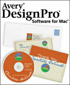
Avery offers full-featured, free DesignPro
Avery, the office product and label-making company, now offers a free Mac application called DesignPro to help customers design everything from labels to T-shirts to CD art. This is the classic 'give away the razor and charge a premium for the razor blades' marketing model: you get the free software, but to use it you will need to buy custom Avery packages to cram into your inkjet printer.
Of course, I had to try it.
First, some discussion about the software package is warranted. To get it, you must register. I always find this a bit off-putting, but I dove right it. Hey, it's free. Then I proceeded to the download, which is a jarringly-large 232 MB file. This worried me somewhat. Why on earth was it so large? Proceeding to the installation, my worries grew apace. You put this package on your system via an installer that requires your admin password, which is indication that it's (at a minimum) going to put stuff in your main Library folder. Ok, but what's going to go there? I proceeded with the install, expecting some sort of indicator of what it installed and where it put it. I got nothing of the sort.
In an attempt to figure out where all those megabytes went (the app itself is only 8 MB!), I used AppZapper, a great little uninstaller program that gets rid of all the odds and ends a program typically leaves behind. This is a lazy method I sometime use to see what is installed where for a given package. When you drop a program into the AppZapper target window, it lists all of the program components it will uninstall (including the path of the files).
When I did this for DesignPro, however, it only found about 8MB of data to uninstall: a preference file and the main application from the app folder. Ok...so where were the hundreds of megabytes of data I just installed? I suspect that this is not the fault of AppZapper; my guess is that it's tied to the unique installation process of Avery DesignPro.
I then completely deleted the program and reinstalled it, hoping to get some clues from the DesignPro installer by paying closer attention this time around. Alas, it was to no avail. The only noteworthy option I could find in the installation process was a 'customize' prompt within the installer. This option presented me with three choices (meaning I could choose to install or not install three different components by checking a box). The choices: the DesignPro application, a QuickLook plug in, and 'resource files.' No path information was presented. Oddly, each selection displayed as 0 bytes in size regardless of whether the box was checked or not. And there was no indication of what the 'resource files' were and if I really needed them. Not too helpful.
Finally, after the reinstall, I decided to manually search through my Library folders to discover where the application installed its bits and peices (Spotlight, in case you're wondering, did not offer up any clues about the locations of the mystery files...although, in retrospect, I suspect it would have if I had refreshed the index).
Turns out that this app installs in a few locations: your main Library in a folder called DesignPro (which contains about 318 MB of data) and in your user account Library in a folder called DesignPro (which is about 7 MB). The user account library contains a sqlite database, by the way. I'm not sure what the app is storing there, though. I created a few labels and saved them, and the sqlite database remained the exact same size.
When you create a project and save it, it is placed by default in your documents folder. And if you open up your projects, it opens up in the app as expected. I tried out QuickLook on one of these documents, and it does present a preview of the project as advertised.
The moral of the story is this: if you want to delete this application completely, there is an entry in your main Library and your user account Library labeled 'DesignPro.' There is a preference (plist) file located in your user account Preferences folder, as expected. And there is the main application in your Applications folder. I thought this would be handy to pass on since the data that AppZapper missed was over 300 MB in size).
Most of that data is nothing more than templates and clip art. It would be nice to have a choice to NOT install this 'extra' stuff. I suspect this alone would decrease this very large package down to a much more reasonable 20 MB or so. I would also prefer the option to install this app in one user account only. I don't want to install it system-wide.
One thing is certain: if I start to experience weird system behavior and bugginess, at least I know where to start. My first step will be to delete this app.
At any rate, DesignPro seems to work just fine so far.
So what does it do? It helps you create labels of every imaginable shape and size, business cards, name badges, cards, T-shirts, CD/DVD labels, photo badges and more. You can choose from what appears to be about million Avery templates and create a quick design from a template (or create your own design). There are, in fact, over 1,300 template designs and over 2,000 clip art files from which you may choose.
DesignPro handily allows for data merging from Apple Mail and Address Book. It allows you to import images from iPhoto and import playlist data from iTunes for media projects. My initial take is that this is a full-featured product that may come in very handy for designing and printing simple projects using Avery standard labels. As someone who does not use MS Word (I use Pages), it's a welcome addition to quickly create mailing labels, badges, or other sticky-backed print jobs with ease.
Having said that, I would not say that this is the easy-to-use and intuitive Mac user experience claimed by Avery. It will take some getting used to. The user interface is odd. It has the weird feel of a ported Windows application haphazardly mixed with only a few familiar Mac OS elements and controls. It is confusing. It is also packed to the rafters will gratuitous clip art, templates and special effect options which are hauntingly reminiscent of low-cost commercial print packages I recall from my Windows days. But, hey, it is free and it does do the job. It's worth a look.